share ko lang dito yung post ko sa photoshop/digital arts thread, since iPhone/iPod Touch related naman to 
--
I was writing a document about
"Usability" and
"User Experience" when I realized I need a sample to show some applicants about it, to define it into an illustration to better interpret it, I tried to think of a website that I can simplify or re-introduce into a different medium.. to use it in a different experience rather than its original form..
I thought about.. why not I
try creating a wireframe/UI flow of a forum site reintroduced into a mobile app? so I thought about Philmusic and was challenged on the site's technical complexity and data distribution (being a text-rich forum site) and how to make a version of it for the
Apple iPhone/iPod Touch.. it was not that easy..

Atleast for the UI flow I was able to draw up a nice mock up that makes sense..
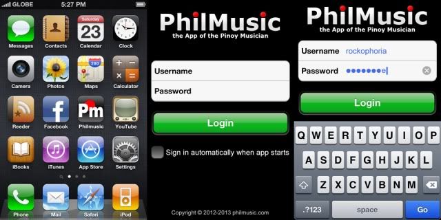
I created a
main menu that resembles the main philmusic board.. grouping the
"PhilMusic.com Announcements & Feedback", "Musician's Forums", "The Musician Classifieds", "Pinoy Music Fan Forum", "Tech Forums" and
"Anything Goes" into
icons that will contain the sub-forums into
"page navigation-type" flow to simplify user interaction.
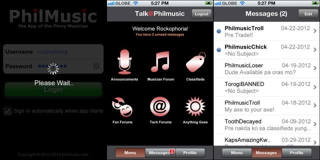
The main menu
is also a part of a 3-page dashboard that also has the
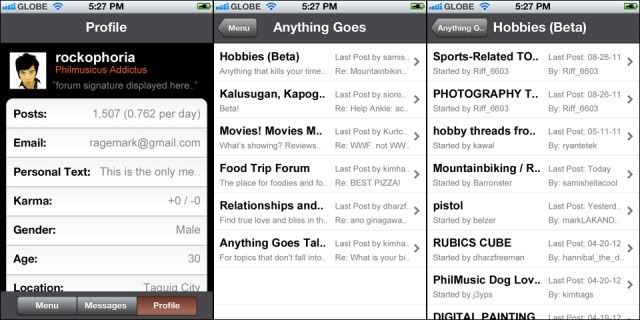
"messages" area and the
"user profile" area, they are all neatly embedded into a
toolbar segmented control for easy user access.
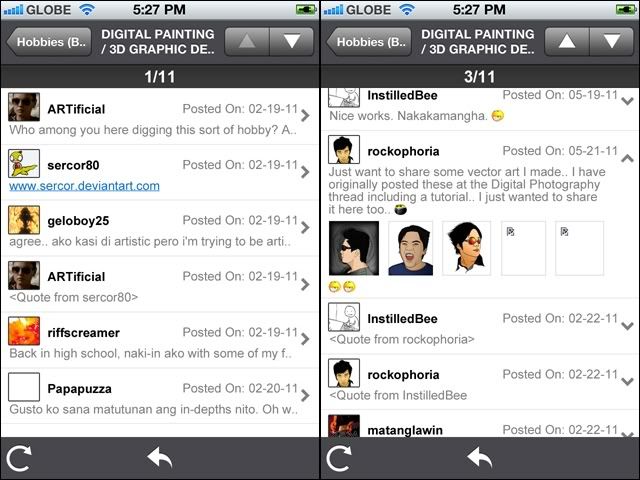
The main challenge is the
forum interaction itself.. the texts are simply overwhelming the physical 320x480 screen thus I use an approach called
"progressive disclosure" to display the replies on threads..
replies in default are viewed in "hint" mode and
the whole reply can be seen by tapping the row to collapse the whole cell displaying the rest of the message, and since most of the time the message/replies has
linked images it is automatically displayed in "thumbnails" and can be seen in full-view by tapping on the images..
I have seen 2 forum applications in iTunes, I downloaded them and tried them.. one has a very complicated UI that also has moderator controls in it making it less intuitive.. the other one only had their livechat embedded into the app but when viewing the forum threads displays a "browser view" of the full forum site itself thus contradicting the relevance of having it converted into an simplistic app in the first place..
Converting a forum site into a mobile app
doesnt mean that one must import/integrate all original controls and options into the application, since the
general idea is to "simplify" the usage and make something originally used only in a fixed medium (like a forum site viewed in a browser using a desktop) into an accessible, on-the-go, easy to use mobile application
that will offer the user the logical options he might need access on the road using his mobile phone like
"replying to a thread", "reading personal messages sent by other forumers" and
"changing his avatar photo"  Starting a new thread
 or adding
moderator controls in my opinion complicates the UI since
it will create more options that means "more buttons" and that means
"more space" needed that cannot be forced into a small area of a mobile device.. we can save those tasks to the tablet and desktop browsers..
Again this is just created
to exercise my mind and not meant for development.. I just find forum sites very "tricky" when converted into a mobile application. and since I bothered using philmusic as an inspiration.. I kinda find it cool to share it here


